Below is the link to my Crowthorne Echo website:
http://www.edgbarrowmedia.co.uk/jamesn/
Tuesday 1 December 2009
Monday 30 November 2009
Friday 20 November 2009


Thursday 12 November 2009
Wednesday 11 November 2009

Tuesday 10 November 2009


Friday 6 November 2009
Thursday 5 November 2009

Tuesday 3 November 2009

Poster
Below are two pictures of two newspaper poster advertising the newspaper:


I have created a layout plan below of how I will lay out my advertisement poster.

There are not too many codes and conventions which I need to me aware of when creating a newspaper advertisement poster. There are only a few main ones which I will need to make sure I am aware of. The codes and conventions of these posters are below:
- Large bold headline.
- Short & snappy headline.
- Include the newspaper name.
- Include the newspaper logo.
- Use suitable colours which relate to the newspaper.

I have created a layout plan below of how I will lay out my advertisement poster.
There are not too many codes and conventions which I need to me aware of when creating a newspaper advertisement poster. There are only a few main ones which I will need to make sure I am aware of. The codes and conventions of these posters are below:
- Large bold headline.
- Short & snappy headline.
- Include the newspaper name.
- Include the newspaper logo.
- Use suitable colours which relate to the newspaper.
Friday 23 October 2009
From Mrs S
Some good stuff here James. Is it time you started thinking about the contents of your stories?
Wednesday 21 October 2009
Newspaper & Website Layout
When trying to find out how I was going to lay out my website I had a look over a whole variety of different websites from local ones on my area to London. I used these different websites to look at their linked pages but also there main pages and got ideas from their to use on mine. I do not want mine to look the same but I looked at this to see what other codes and conventions I could potentially use. My website linked page contains all the necessities of a section of the website and hopefully I have chose a layout which will be easy for the reader to understand and read. Below is a link to one of the newspaper websites which operate in the neighbouring area to mine.
http://www.getwokingham.co.uk/sport/
Here is another link which is for the local people of reading and there website looks similar to the Bracknell one mainly to using the same template but they also consist of the same codes and conventions. This website gave me an idea of what different articles I could include in my newspaper/website because they varied from the previous website, but I was able to see what type of articles are included in local newspapers.
http://www.getreading.co.uk/sport/
I have also looked over the “Metro” which is the local paper for the city of London. This newspaper is handed out throughout London at different train and tube stations. I looked at this newspaper to give me an idea of what to include of mine so I looked at a whole different variety of newspaper to give me more ideas.
http://www.metro.co.uk/
Tuesday 20 October 2009


Pictures
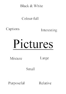
Throughout my newspaper and also my website I am going to include many pictures as pictures are one of the main parts of a newspaper for many reasons. Many people when reading newspapers they like to see them as they see them interesting and also people like to see what the article is about is it gives them more information. When making my newspaper I will try my hardest in trying to make my pictures as relative as possible so that the reader's do not become confused and lose interest in my newspaper.
I will try to use a whole different variety of pictures from large ones to small ones. When looking over the different newspaper and websites many of them included many pictures but generally were different sizes with a mixture of small and large. Generally all of these pictures were colour-full and gave the newspaper/website a consistant look and feel. Also when I include pictures on mine I will make sure that I put a caption below the picture so that the reader can see what the picture means if they do not understand.
I will try to use a whole different variety of pictures from large ones to small ones. When looking over the different newspaper and websites many of them included many pictures but generally were different sizes with a mixture of small and large. Generally all of these pictures were colour-full and gave the newspaper/website a consistant look and feel. Also when I include pictures on mine I will make sure that I put a caption below the picture so that the reader can see what the picture means if they do not understand.

Potential Language to use
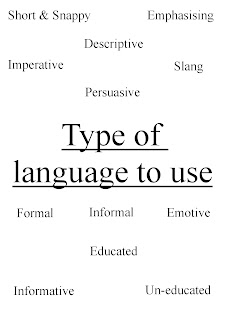
In my newspaper and website I am going to use different types of techniques so that it is targeted at a whole variety of people. I think that I am going to use a lot of formal language and informative language throughout my newspaper and also carry this on to my website. by inlcluding these types of language this will give my newspaper a professional look and feel but will also hopefully keep the reader's interested. Generally in newspaper the title's are short & snappy and nearly always slang or informal. By including short & snappy titles this grabs the reader's attention and potentially pursuades them into wanting to read the article, this wil also attract the younger members of the area as we want to target as many people as possible. We do not want to include a lot of slang though as generally in local newspaper not much of this is used and this could cause are newspaper to look un-professional. Below I have created a spider diagram of all of the potential different language techniques which I could of used:

Potential Articles

Potential Articles to be included in my newspaper/website
I have created a list below of all the different ideas which I have come up with which I could in my newspaper/ website. I want to include a whole variety of different articles with some being large and some being smaller. I don’t want to include articles which don’t relate to the local area and I also don’t want to include any which they would lose interest in reading. Below are my ideas which I have come up with:
- Local school Edgbarrow, sixth form building
- Postal strikes threaten schools applications bid
- Warning for mini motor drivers
- Local man breaks record
- Plan to rebuild local hall
- AFC Crowthorne 4 – 3 Wokingham & Emmbrook
- New hairdressers to be in Crowthorne
- A chance to win £10,000
- Local Stabbing (main)
Monday 19 October 2009
Friday 16 October 2009
Planning of Tagline

For my newspaper tagline I have created a spider diagram of all of the best ones which I came up with. All of the ones in the list were reasonably good for my newspaper but I thought one was better than the others. I asked people in my focus group which one that they thought was the best and generally they all thought the same as me.
The tagline which came out as the most popular was "The Local Voice". I thought that this tagline was very suitable for my newspaper for many reasons. This name has a meaning to the newspaper because the local part means a local newspaper that is what I am creating. The voice part of the tagline also fits in with my newspaper because it's like the newspaper is a voice for the local people telling people about information and other issues in the area. So I think that using this will help my newspaper much more unique and specific to the area in which I am going to be operating.
Planning of Potential Fonts

Above I have made a spider diagram of all of the potential fonts which I was going to use with both my newspaper and my website. There were many fonts to choose from but I have chosen to use "Times New Roman" as my font for both the newspaper and website, this font is used frequently by a lot of people. I was also seriously contemplating using Arial and Microsoft Sans Serif but these did not seem to popular with people in my focus group so I decided against this in the end.
I think that this font looks very professional and will give the newspaper and website a consistant look. Out of most of the potential fonts which I was going to use I thought that this font was most suitable and so did many people which I asked to comment on this. Also people asked about wat font they thought who were in my focus group also thought that this font looke most professional and is the type of font they thought would look suitable on a newspaper.
Thursday 15 October 2009
Planning of Potential Colour Schemes (Website)

After analysing different local newspaper's websites on the internet I decided to create a spider diagram of all the potential colour schemes which I could potentially use on my website. It is always a good idea to create a consistant colour scheme which is used to be associated with your newspaper as it gives it a consistant feel, also it will help with the branding of the newspaper because all the colours are similar of the same. All of the ones listed in the spider diagram above were all potential colour schemes which I was thinking of using. I asked people randomly from my foucs group what colours they thought was be most suitable and generally their views reflected mine. Most people thought that "Dark Blue & White" would be most suitable and I also thought this. The main newspaper in the area use colour schemes of purple and white and also light blue and white. I did not want to use similar colour schemes to other newspaper websites in the area so I decided to use Dark Blue with White.
Below is the link to the Wokingham newspaper which is a local newspaper in the area. I analysed their website in detail. From clicking on the link below you will be able to see their local newspaper website. The colour scheme on their newspaper is purple and white.
http://www.getwokingham.co.uk/
Below is the link to the Bracknell newspaper which is also a local newspaper in the Berkshire area. I have briefly analysed this website but not in detail like the Wokingham newspaper. On this website they have a colour scheme of light blue and white so these colours will be associated with this newspaper and will give the newspaper a consistant feel and look.
http://www.getbracknell.co.uk/
Planning of Newspaper Logo
What is a logo?
A logotype, commonly known as a logo, is the graphic element of a trademark or brand, which is set in a special typeface/font, or arranged in a particular, but legible, way. The logo of a business should be a symbol or have a special meaning that defines a business.
I want to create a logo so my newspaper is unique and their is a logo which is associated with my business and when people see it they know it is "The Crowthorne Echo" When picking a logo for my newspaper business I need to make sure that the logo has a theme that matches my business and it is different from other business logos so it is more recognisable. I am looking to designing a unique logo that will identify your business.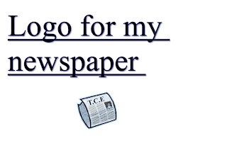

Planning of Newspaper Names

After doing some detailed research into the local newspapers I found out that the name which I was going to use is already in use by one of the main newspaper in the area. This shows that the name was obviously good as another newspaper was already using it but I am not going to use it now, the name of the newspaper was “The Crowthorne Times”. This name came out the clear favourite in the questionnaire which I created and asked to a variety of people. This name was copyrighted so I would not be able to use it, and also I would not want to because I would not want my newspaper to sound like another.
Once I found this out I decided that I need to change the name of my newspaper. I then decided to ask people randomly in my class which name they thought would best suit my newspaper out of the ones listed above.
I have now decided to use the name “The Crowthorne Echo” after it coming out the clear favourite against all of the others. I also thought that this was a good name to use because I think that it sounds very professional and it is a very good name for a local newspaper. So my newspaper is going to be called “The Crowthorne Echo”.
Wednesday 14 October 2009
Website Questionnaire Analysis
1. Are you Male of Female?
Out of the people in my foucs group I tried to ask even amounts of both genders. As I was only asking 15 the questionnaire on my website I had to ask one more than the other. So I asked 8 Male and 7 Female, this should not affect my results too much and I should still get reliable feedback from them.

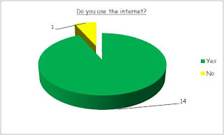
2. Do you use the internet?
Out of the 15 people which I asked this questionnaire to only 1 of them said that they didn't use the internet. This was because they preffered to read any news or information directly from the newspapers itself. As 15 people answered that they do use the internet this shows the growing amount of people using it so this could mean that my website is a success and people will use it to gain information on their local area.

3. Where do you live?
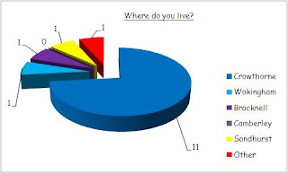
From this questionnaire the majority of the people asked lived in Crowthorne, this is the village which I am going to be creating a local newspaper for. As I asked a lot of people from this questionnaire I will be able to see what the people like and so I can target them directly. The other people who were asked the questionnaire who lived in other areas, there feedback is still useful because it still gives me an idea of what people like to see even though in not targeting them directly.

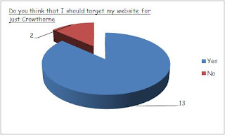
4. Do you think that I should target my website for just Crowthorne?
Nearly all of the people asked this question thought that it would be a better idea to target my newspaper just to Crowthorne. 13/15 asked the question thought that I should only target my newspaper for Crowthorne. This was because they thought it would make the newspaper more specific to one area and more unique. They also said if I was to target a few different villages the information would be very vague where as if I targeted just Crowthorne it would be detailed on just that village, meaning it's more interesting to read.

5. Would you like me to include pictures on the website?
All of the people asked this question thought that I should include pictures on my website of my local newspaper. They thought this because when pictures are included on things such as newspaper, magazines, websites etc it makes it look much more interesting and appealing. As all of the people asked the question thought I should include them, I will. This shows that most people like to look at a mixture of both text and writing so it is not too boring.


6. Would you like me to include a variety of small and large pictures?
14/15 asked this question said that I should include a mixture of both small and large pictures. They said that if I was to include a variety of small and large pictures this would make the page look much more interesting and they also said it would give the newspaper a professional feel and look. In most newspaper and website generally all of the pictures are not the same size because this would look boring and does mix the page up a little bit making it more interesting.

7. Would you like me to use a consistant colour scheme throughout?
Nearly all of the people asked this question thought that I should use a consistant colour scheme throughout my website. 14/15 asked said "yes" which meant that they wanted to use the same few colours throughout. They thought this because they said it would give the newspaper a consistant feel and if I was to use a whole range of different colours it would not make my newspaper and website unique and totally un-professional.
Nearly all of the people asked this question thought that I should use a consistant colour scheme throughout my website. 14/15 asked said "yes" which meant that they wanted to use the same few colours throughout. They thought this because they said it would give the newspaper a consistant feel and if I was to use a whole range of different colours it would not make my newspaper and website unique and totally un-professional.

8. Would you like me to use the same font throughout my website?
All the people aksed the question thoought that I should use the same font throughout the website as they also thought it would give me website a consistant look and feel. Like the colour scheme they said that if I was to use a whole different range of fonts this would look totally un-professional and un-organised. I think that all the text should be in the same font with maybe the different titles in a larger font of different type but the text should not be in different fonts.
All the people aksed the question thoought that I should use the same font throughout the website as they also thought it would give me website a consistant look and feel. Like the colour scheme they said that if I was to use a whole different range of fonts this would look totally un-professional and un-organised. I think that all the text should be in the same font with maybe the different titles in a larger font of different type but the text should not be in different fonts.

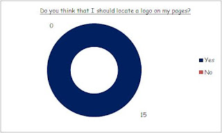
9. Do you think that I should locate a logo on the website pages?
All 15 of the people asked this question thought that I should include a logo throughout the website pages. They said that this would make the website look unique and you would then have something to associate with my newspaper and website. When people see this logo I want them to think of my newspaper straight away.

10. Would you like me to include advertisements on my website?
13/15 said they wanted me to include advertisements on my website. They said this because as I am operating a local newspaper business the advertisements will be of local businesses in the area. This would mean that the adverts would relate to them directly instead of being a national service which they are less likely to use. So I was to include adverts of local business then I would be providing them with valuable information which they could use.

11. Would you like their to be navigation buttons on my website linking to other pages?
Nearly all of the people asked this question said that they would like me to have a toolbar with all the navigation buttons linking to the other pages throughout the website. I will have a toolbar with all the other pages on the website with things such as "sport" for example. These navigation buttons make it easier for the people using the website to navigate around the website, so if I make it easier for them they are less likely to lose interest and stop reading or using the service.

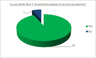
12. Do you think that I should allow anyone to access my website?
I was going to make the website a private website which only people in the village in which I am operating can use. But after asking this question I decided not too as 14/15 said I should let anyone access the website. This was mainly because other people might have moved away but still might want to find out information in the area, or even people in neighbouring villages might want to see what's going on in the village as they could be attending an event or moving there for example. I came up with the thought of people having to have a log-in system which they use their e-mail to log to the website. I might create this system a few months into the website if it is a success as then we could send them e-mails etc advertising the newspaper and events in the area.

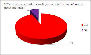
13. If I was to create a website would you use if to find out information on the local area?
Nearly all of the people asked this question said that they would use my website to find out information on the local area. 14/15 asked said that they would use my website to find out information. They said that they would read both the local newspaper through the door but also look at the internet website for other updates throughout the week. Only one person said that they wouldn't use the website which is good, they said this because they only like reading newspaper and were not experienced on computers so they wouldn't use the service.

14. Is there any other infromation which you would like to provide me with which would help me in the construction of my website?
No one answered this question so there was no feedback to give back.
Tuesday 13 October 2009
Website Questionnaire
I have created a questionnaire for people within my focus group to help me understand what people would like to see on my website linking to the newspaper. The questionnaire which I created can be seen below:
1. Are you Male or Female
Male
Female
2. Where do you live?
Crowthorne
Bracknell
Sandhurst
Camberley
Wokingham
Other
3. Do you frequently use the internet?
Yes
No
4. Do you think that I should target my webite for just the village of Crowthorne?
Yes
No
5. Would you like pictures to be included in my website?
Yes
No
6. Would you like a variety of small and large pictures to be included on the website?
Yes
No
7. Would you like their to be a consistant colour scheme used throughout the website?
Yes
No
8. Would you like their to be a consistant font used throughout the website?
Yes
No
9. Do you think that I should locate my logo on different pages throughout the website?
Yes
No
10. Would you like their to be advertisements on my website?
Yes
No
11. Would you like their to be navigation buttons on my website linking to other pages?
Yes
No
12. Do you think that I should allow anyone to access my website free of charge?
Yes
No
13. If I was to create a website would you use it to gain information on the local area?
Yes
No
14. Is there anything else which you would like to add which would help me in the construction of my website?
.........................................................................................................................................................................
Thursday 8 October 2009
Tuesday 6 October 2009
Tuesday 29 September 2009
Real Media Artifacts
Wokingham News Front Cover


This issue of the Wokingham Times is laid out like most local newspapers around this local area but also across England. Generally on the front page their will be a main article about something which is happening or happened in the local area, this newspaper is not different on the front cover there is a article explaining something which happened in the area. There is nearly always a large masthead at the top of the page with the name of the newspaper “Wokingham News” followed by “Crowthorne and Sandhurst Newsweek”, this is the name of the newspaper. The “Wokingham News” is located at the top of the page in large bold lettering. This is followed by the other heading in bold lettering but this is not quite as large as this is not the main name of the newspaper. On this newspaper the date and price of the newspaper is situated on a red strip in white writing because this makes it stand out and easy to see for the reader. On this front page there is a fair bit of text about the main article, all of this text is split into even columns like most newspapers. By doing this, this makes the newspaper look more professional and gives the newspaper a much more consistent feel. I will make sure that I do this in my newspaper because I want to make it look as professional as possible. There are a lot of advertisements on this issue of “The Wokingham News”. All of the advertisements are advertising local businesses and events in the area. It is much better to advertise local business rather than national in local newspapers because this way you will be targeting the right people and there is more chance of getting business for these businesses. These advertisements are very colour-full but they do not take much room up on the page because the bigger the ad the more expensive for the business. I will include many local advertisements on the front page but also through out the newspaper because this is whole I am going to fund to make the newspaper. Also on this paper to make it look more colour-full and interesting there are many pictures included. This makes the newspaper look much more interesting but it also gives the articles a meaning because generally the pictures relate to the article. These pictures are generally always followed by a caption explaining the picture to give an explanation of the picture.
Wokingham News Second Page

This second page of the newspaper is also laid out like most local newspapers which are available in the area. This second page also follows typical codes and conventions of other newspapers as it give the newspaper a consistent look and feel. Some of the articles which are advertised and listed on the front of the newspaper are carried over on to the second page. When I make my newspaper I will have main articles on the front page being carried over to the second page like this. On the second page there are many photographs relating to the articles on the page. There are around eight pictures on the page and these give the articles a meaning but they also give the page a colour-full look. Like in newspaper when photographs are included there are also captions which help people understand the picture. These are included nearly always when a photograph is included it adds more detail to the article so people can gain a better understanding. There are also many advertisements on the page and these make the page look much more interesting but they also give the reader some good advertisements which they could use in the future as they are all local business. On this page to make out the different articles they are separated by a bold title which is the articles headline. This makes the page have a layout which you can understand but also it is separated into boxes so that you can make out the different stories. Down the left hand side of the page there is a contents (index) this shows what else is included throughout the newspaper. This also gives people a better understanding of what is in the newspaper but also makes it easier for them to find articles they want to read. All the text on the page is also laid out in columns because this gives the newspaper a professional feel. If they text was not laid out in columns it wouldn’t look professional, it would be harder to read and look more scruffy.
The Crowthorne Times Front Cover

This issue of Crowthorne Times is not much different to the other ones published around the surrounding area. The Crowthorne Times always follows the same codes and conventions so that they create a consistent feel and a professional look to the newspaper. They want to create a certain look so that when people see this newspaper they no it is the Crowthorne Times and they do this by following specific codes and conventions of local newspapers. On the front of this newspaper there is a large bold masthead, this shows the name of the newspaper generally in large bold letters so that it stands out. They want the title to stand out so that when people see their newspaper they will want to read it because hopefully they would have built up a good reputation in the area. Like the “Wokingham Times” below the name of the newspaper there is a section showing the price of the newspaper but also the date in which it was released. This shows me that generally this is where they are situated so I am going to be aware of this when creating my newspaper. Like the “Wokingham News” this newspaper includes a lot of advertising ads. Across the top of the front page there are advertisements. This advertisements is more of an advertisement to try and persuade people into either reading or buying the newspaper because there is a free book inside so they think they by putting this on the front cover more people will see it meaning they potentially they could want to buy the newspaper and read it. There are a lot of other advertisements showing local business such as window companies for example. These local business will pay to put their ad in these papers as this is how many local newspapers fund themselves. These advertisements are very colour-full and they stand out a lot so the ones I include will also need to be as they are very eye catching. There are other things which are also very colour-full on the page. There are also many photographs relating to the articles on the page. All these photographs have a purpose and add effect to what is on the page. All the pictures are in colour so this means they are quite eye catching because if you were to have a newspaper which had no pictures, advertisements etc it would look very boring and not very appealing. There are also other codes and conventions which they follow by including a bar code for example these are generally always on newspapers because some are brought from shops. Other things include sub headings and straplines both of the front covers I analysed of local newspapers also included these.
The Crowthorne Times Second Page


This second page of the “Crowthorne Times” looks like most second pages you would see in a local newspaper because they all follow the same codes and conventions. Down the left hand side of the page there is a “this week” column this shows us the reader what is going to be in the newspaper this week and where you can find it. This also helps the reader in being able to find where the article is located. At the top of the page there is a masthead for one of the articles on the page. This is the main article on the second page so they need a large more bold title so that people know this and so that they can see where it starts. If they were to use a non bold font in small writing then this would be less effective meaning that the reader’s attention is not brought to it. Like all newspaper the text is laid out in clear columns so that the reader knows where the article starts and finished. If they didn’t have columns this would make the text look very boring and long with just loads of long lines of writing. But by breaking the text up into columns this makes it look more appealing to read, I will make sure that I do this in my newspaper. There are also many photographs situated on the page as this makes the page more colour-full and interesting but it also gives the articles a meaning. Below these there are captions which explain the picture so that the reader doesn’t become confused and loses interest in reading. There is also a pug in the top right hand corner showing us the date as this makes the newspaper look more professional. Also the newspaper website is printed at the top of the page, this will help the reader’s because this will mean that they can use their website to find out any extra information that they want to find, I will make sure I include this too. There are also many advertisements on this page, in local newspapers there are generally a lot of newspapers because this is the way they fund them. They are very affective on the reader because they know the business will not be too far from them if their in there local newspaper so they will more likely get used. There are some smaller advertisements and also there are some large ones. So on this second page there is a lot of information which makes the newspaper look much more interesting and colour-full meaning people are more likely to read it.
Subscribe to:
Posts (Atom)