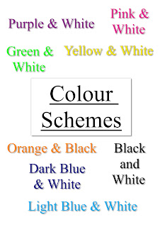
After analysing different local newspaper's websites on the internet I decided to create a spider diagram of all the potential colour schemes which I could potentially use on my website. It is always a good idea to create a consistant colour scheme which is used to be associated with your newspaper as it gives it a consistant feel, also it will help with the branding of the newspaper because all the colours are similar of the same. All of the ones listed in the spider diagram above were all potential colour schemes which I was thinking of using. I asked people randomly from my foucs group what colours they thought was be most suitable and generally their views reflected mine. Most people thought that "Dark Blue & White" would be most suitable and I also thought this. The main newspaper in the area use colour schemes of purple and white and also light blue and white. I did not want to use similar colour schemes to other newspaper websites in the area so I decided to use Dark Blue with White.
Below is the link to the Wokingham newspaper which is a local newspaper in the area. I analysed their website in detail. From clicking on the link below you will be able to see their local newspaper website. The colour scheme on their newspaper is purple and white.
http://www.getwokingham.co.uk/
Below is the link to the Bracknell newspaper which is also a local newspaper in the Berkshire area. I have briefly analysed this website but not in detail like the Wokingham newspaper. On this website they have a colour scheme of light blue and white so these colours will be associated with this newspaper and will give the newspaper a consistant feel and look.
http://www.getbracknell.co.uk/
No comments:
Post a Comment